
5 CSS Tricks to Level Up your Web Development
Discover 5 CSS techniques that will help you make a difference on any web page, creating a much more professional and polished product.
.jpg)
Introduction
Creating websites that meet basic requirements and function is easy, but if we really want to make a difference, we must always stay one step ahead. With CSS, we can achieve certain details that wouldn't be possible otherwise, particularly for specific cases we can control using CSS.
In this article, we'll explore 3 essential CSS techniques that will help you elevate your web design game.
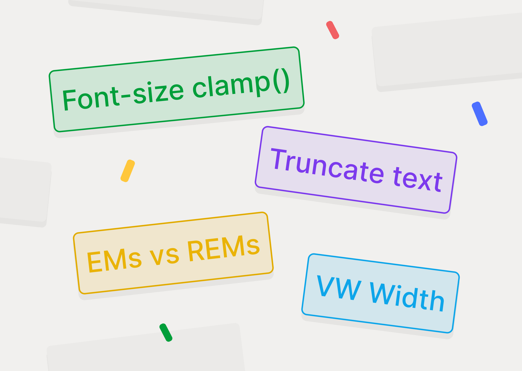
Tip 1: VW Width in Height + Max Height in REMs
One of the key aspects of web design and development is responsiveness. We want our content to look its best on any device.
Keep in mind that in web design, we typically work with a width of 1440px, but in development, we never really have a fixed measure. Some will have 1920x1080, others 1440x1024, others 1440x1080, and some even 375-812px.
Moreover, these measurements only apply when the browser window is fullscreen relative to the screen. As soon as you collapse the screen a bit, you might have a resolution of 1442x1079. Therefore, we need everything to look as good as possible at any resolution.
First, let's see the problem if we do it the traditional way, setting a fixed width and height in REMs.
As you can see, it looks good with minimal responsiveness, but it could be better.
Now, we'll set the height to 25VW instead of REMs and see what happens. The image looks much better and always maintains its aspect ratio as it becomes responsive.
And with this, you might think it's enough, but don't stop here because we haven't checked other resolutions. It seems fine from the current size to smaller resolutions. But what happens when everything gets bigger?
With 25VW and no maximum size, the image will grow infinitely, as shown in the video:
What we want is for the image at 1440px resolution to maintain its proportions both when it gets smaller and when it gets larger.
Therefore, we'll use a max height, in this case in REMs, so it doesn't scale infinitely.
Important to note: When designing and coding anything, try to think beyond what you're designing. If you design something at 1440px, take 5 minutes to think about how your design would look if it were narrower or much larger.
Preparing your design for more situations beyond the ones you design for is crucial to ensure the best possible experience.
Tip 2: Font Size Clamp
Just like in the previous section, we want our designs to be as responsive as possible, functioning correctly on any resolution.
Earlier we talked about images, now let's talk about text. What happens when you have text at a certain size and the resolution becomes smaller?
The simplest way to solve this is with breakpoints.
In each breakpoint, we change the values, manually of course.
In web design, breakpoints are specific points defined in CSS stylesheets where the page layout changes to adapt to different screen sizes and devices. These breakpoints allow creating a responsive design, meaning a design that adjusts and functions on a wide variety of devices, from mobile phones to large desktop screens.
- Desktop breakpoint: 1440px
- Tablet breakpoint: 768px
- Mobile breakpoint: 375px
This allows you to determine:
- When the screen resolution is between 1440px and 768px, you can set the text to 64px.
- Then, when the resolution is below 768px, set the text to 48px. And so on with each breakpoint.
You set 4 change points, and in these changes, you establish a resolution.
This means:
- If we use breakpoints, the typography will stay the same between 1440px and 768px.
But as you can imagine, 1440px is significantly wider than 768px. So, how do we ensure the text looks as good as possible at any resolution without relying on breakpoints?
A logical thought is, if my screen is 1440px wide and I set the typography to 64px, it won't change. But if I set the text to 50VW, it will change.
Remember, VW is Viewport Width, meaning the text will be 50% of the viewport width.
- In this case, if the viewport is 1440px wide, the typography will be 720px.
- If the viewport is 1387px wide, the typography will be 693.5px.
In other words, there's never a fixed size, it's always proportional to the existing viewport. This is perfect because it looks good at any size. Remember, we don't control any viewport; we design for all the infinite viewports that may exist.
Now, like with images, this is great for responsiveness, but it has a problem: If it grows and shrinks proportionally, it will also grow and shrink without limits, becoming extremely large and extremely small.
For images, we set a max height of X rems. Here, we need to do the same.
One option is to consider using VW for the font size, so that the font size is relative to the web page, and it works, it really is a good solution. However, if we do not specify a maximum and a minimum, this will happen:
So, if we control it through breakpoints, we have to manually specify the values, but since we never have a fixed resolution, it might look good at 849px, but not at 830px.
VW solves this, but of course, it can be as small or as large as it wants without limits. Therefore, what we will do is set limits. The line clamp precisely allows you to set: minimum size, default size, and maximum size.
You can use a calculator and specify the values that are most relevant to you.
This means it's always responsive but never shrinks below X pixels and never exceeds X pixels.
We'll always make it responsive but with growth and shrinkage limits. We want the content to adapt to the viewport but within accessible and readable limits.
Look how good it looks :)
Tip 3: Truncate Text
"Truncate text" is a technique in web design and frontend development that involves shortening or reducing text when it exceeds a certain length limit.
This is especially useful when displaying text snippets in limited spaces, such as in cards, lists, or mobile interfaces.
When truncating text, an ellipsis ("...") is usually added at the end to indicate that the content has been shortened.
Here’s a video showing content with truncate and content without truncate.
For example: You design a blog summary to have a maximum of 2 lines, but then the screen collapses, and items become compressed, resulting in a line break, and instead of 2 lines, you get 3 lines, causing some items to have 3 lines and others 2 lines, creating a visual discrepancy.
What you can do is limit it to 2 lines. This means the text will never exceed 2 lines, and when forced to due to lack of space, an ellipsis will appear to limit the text.
The only thing you need to do to achieve this is to add the following CSS code:
The key here is the line-clamp, which will determine from how many rows you want this to occur.
This will be applied to the divs that you choose. Simply add the corresponding class to the paragraph you want this to apply to as a combo class, and it will automatically take effect.
Tip 4: EMs and Percentages (%)
When developing websites, we start with pixels (PX), but then we learn to use REMs to make the development responsive. Some developers go further, but many stop at this step.
To create the most professional websites possible, we need to understand that there are more options beyond just A or B. When we think only in pixels and REMs, we overlook VW, CH, percentages, EMs, among many others.
At Koala, we use REMs for text sizes and EMs for letter spacing and percentages for line heights.
Why? In web design, rem and em are relative units of measure used in CSS to define font sizes, margins, padding, and other design elements. Both units create flexible and responsive designs, but they differ in how they are calculated and applied.
This is what happens if we use REMs: we are forced to use different values for each breakpoint.
But if we use percentages, we don't have to do anything; we just configure it once at the beginning.
As you can see, it looks perfect on all breakpoints, and we only configured it at the beginning. The same applies to using EMs for letter spacing. If we used REMs or pixels for letter spacing, we would have to configure it for each breakpoint, but what we want is to make configurations that work well across most resolutions with minimal effort on our part. This is called responsive design.
em
- Definition: em is a unit relative to the font size of the immediate parent element.
- Calculation: If the parent element’s font size is 16px, then 1em in a child element equals 16px. If the parent element’s font size changes, 1em will adjust accordingly.
- Inheritance: em units inherit, which can cause cumulative effects. For example, if a container has a font size of 2em (32px) and a child element is set to 1.5em, the child element’s font size will be 1.5 * 32px = 48px.
- Common Use: em is often used to define internal spaces (padding), margins, and other elements that should adjust according to the parent element’s font size.
rem
- Definition: rem is a unit relative to the root element’s (<html>) font size.
- Calculation: If the root element’s font size is 16px, then 1rem always equals 16px, regardless of any parent element’s font size.
- Inheritance: rem units are unaffected by intermediate parent elements’ font sizes. They only refer to the root element’s font size.
- Common Use: rem is often used to define font sizes, providing consistency throughout the document regardless of the DOM hierarchy. It is also useful for margins and padding when a more predictable and consistent design is needed.
When to Use em vs rem
- em:
- Use em when you want an element to adjust proportionally to its immediate parent element’s font size.
- It is useful for nested components and adjusting padding and margins that depend on the immediate context.
- rem:
- Use rem when you want consistency throughout the document, regardless of the DOM hierarchy.
- It is ideal for font sizes, ensuring uniform sizes that are easy to manage in different parts of the page.
- It is also useful for margins and padding when a more predictable design is desired.
EMs for Letter Spacing Instead of REMs
Using em instead of rem for letter spacing (letter-spacing) in web design is a best practice because em allows letter spacing to scale proportionally with the font size of the element, ensuring consistent and responsive spacing. Here are some key reasons for this preference:
- Proportional Scaling:
- Using em for letter spacing ensures that the spacing scales proportionally with the element’s font size. For example, if the font size increases, the letter spacing will also increase proportionally, maintaining a harmonious look.
- Contextual Flexibility:
- Letter spacing defined in em adapts to different font sizes in various contexts. This is especially useful when an element’s font size might vary based on different styles or media queries.
- Responsive Design:
- em units support responsive design principles by allowing letter spacing to adjust dynamically based on the font size of the parent element. This ensures that text remains legible and aesthetically pleasing across different devices and screen sizes.
- Design Consistency:
- When multiple elements inherit different font sizes, em units ensure consistent spacing relative to each element’s font size. This avoids discrepancies that could occur if rem units were used, which remain fixed regardless of the parent element’s font size.
To accomplish all this, we have used Webflow as an intermediary tool, but these are general CSS tips. This will work for any type of code that uses pure CSS, whether you are building a website from scratch in Visual Studio, Framer, Webflow, WordPress, or anywhere else. This is pure and straightforward CSS theory.


